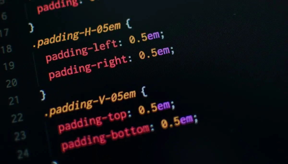
CSS is a crucial skill for every web developer, and it’s constantly evolving with new features and techniques. In 2025, mastering CSS can help you create visually appealing, high-performance websites that adapt seamlessly across devices. Whether you’re designing intricate layouts or adding subtle animations, these essential CSS tricks will elevate your development skills.
1. CSS Grid for Advanced Layouts
CSS Grid is a powerful tool that enables developers to create complex, responsive layouts with minimal effort. Unlike traditional layout methods like floats or inline-block, CSS Grid provides a two-dimensional system that makes positioning elements more intuitive and efficient.
Best Practices:
- Use
grid-template-columnsandgrid-template-rowsto define flexible grid structures. - Implement
grid-auto-flowto automatically place elements within the grid. - Combine CSS Grid with media queries to create dynamic, responsive designs.
2. Flexbox for Simple Alignments
While CSS Grid excels at building full-page layouts, Flexbox is ideal for one-dimensional alignments and smaller components. It simplifies tasks such as centering elements, adjusting item spacing, and maintaining flexible layouts.
Best Practices:
- Use
justify-contentto control horizontal alignment andalign-itemsfor vertical alignment. - Utilize
flex-wrapto handle responsiveness without breaking the layout. - Pair Flexbox with CSS Grid for enhanced flexibility in complex designs.
3. CSS Variables for Better Maintainability
CSS Variables (custom properties) allow you to define reusable values that improve code maintainability and reduce redundancy.
Best Practices:
- Declare variables globally in
:rootto maintain consistency across stylesheets. - Use variables for colors, font sizes, and spacing to ensure uniformity.
- Leverage
var(--custom-variable, fallback-value)to provide a default option when a variable is not defined.
4. CSS Transitions and Animations
Adding smooth transitions and engaging animations can significantly enhance user experience. CSS transitions allow elements to change properties gradually, while keyframe animations enable more complex motion effects without JavaScript.
Best Practices:
- Use
transitionfor hover effects and interactive elements to create smooth animations. - Implement
@keyframesfor complex animations like fading, bouncing, and sliding. - Keep animations subtle and avoid excessive motion that may impact performance.
5. Media Queries for Responsive Design
Media queries allow you to apply different styles based on device characteristics, ensuring a seamless user experience across various screen sizes.
Best Practices:
- Use
min-widthmedia queries (@media (min-width: 768px)) to create a mobile-first design. - Leverage
prefers-color-schemeto automatically switch between dark and light modes. - Utilize container queries for better component-level responsiveness.
6. Pseudo-Classes and Pseudo-Elements
Pseudo-classes and pseudo-elements provide additional styling control without modifying HTML structure.
Best Practices:
- Use
:hover,:focus, and:nth-childto add interactivity and dynamic styling. - Implement
::beforeand::afterfor decorative elements without additional markup. - Leverage
:has()(supported in modern browsers) to apply styles based on child elements.
7. Box Shadow and Text Shadow Effects
Adding depth and contrast with shadows can enhance the visual appeal of elements, making interfaces look more polished and professional.
Best Practices:
- Use
box-shadowto create realistic depth for buttons, cards, and modal windows. - Apply
text-shadowto improve readability and add stylistic flair to typography. - Experiment with multiple shadows for layered effects.
8. Advanced Selectors for Cleaner Code
CSS offers powerful selectors that help reduce reliance on extra classes and IDs, making stylesheets more efficient and maintainable.
Best Practices:
- Use
:not()to exclude specific elements from a styling rule. - Leverage attribute selectors (
[type="text"]) to target specific input fields. - Utilize
:nth-of-type()to style elements dynamically based on their occurrence.
9. Clamp(), Min(), and Max() for Flexible Sizing
CSS functions like clamp(), min(), and max() enable more adaptive sizing solutions without relying on media queries.
Best Practices:
- Use
clamp()to define a fluid font size that scales between a minimum and maximum value. - Implement
min()andmax()to ensure content remains readable across different screen sizes. - Combine these functions with viewport units (
vw,vh) for responsive typography and layouts.
10. Scroll Snap for Smooth Scrolling Experiences
CSS Scroll Snap provides a native way to create smooth, controlled scrolling behavior, ideal for carousels and sections.
Best Practices:
- Use
scroll-snap-typeon the container andscroll-snap-alignon child elements to control snap behavior. - Combine with
overflow: autofor scrollable sections that snap into place. - Avoid excessive snapping to maintain usability and smooth navigation.
Mastering CSS in 2025 requires staying updated with new techniques and best practices to build efficient, visually appealing, and responsive websites. By incorporating these CSS tricks into your workflow, you can streamline development, enhance user experience, and future-proof your designs. Stay curious, experiment with modern CSS features, and continuously refine your skills to stay ahead in the ever-evolving world of web development.


